The global humanitarian aid nonprofit organization, Project Hope, was looking to celebrate their 60th anniversary with a brand refresh.
The Challege
The visual system at that time did not accurately reflect what Project Hope is about, and was sending mixed messages. What was Project Hope about? Marine research? Aquaculture? Logistics? Nautical engineering?
The challenge was to convince Project Hope that their 60th anniversary was the perfect opportunity to take the organization into a new direction, one that better reflected their mission, and communicated their brand in a more relevant way.
The Response
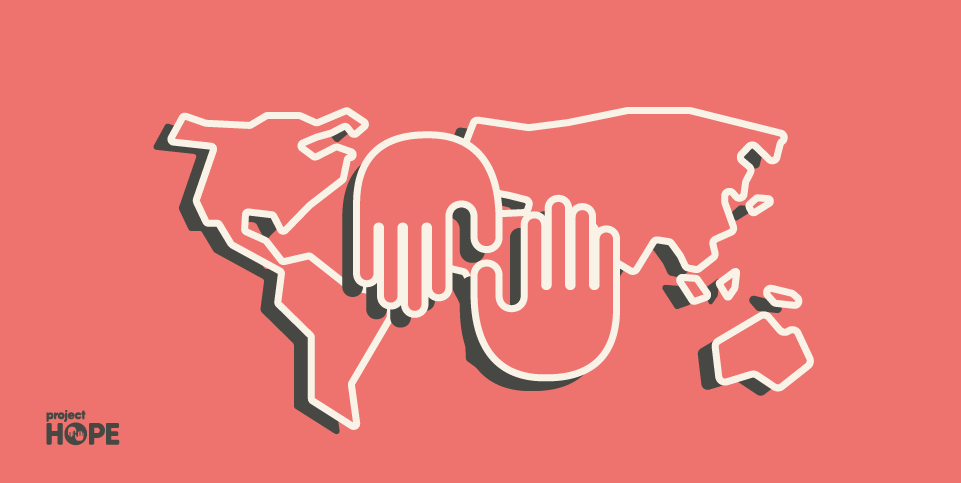
The rebrand was based on the concept of human connection, and the “helping hands” that Project Hope provides healthcare workers around the globe.
The physical shape of the SS Hope is transformed into the concept of the “helping hands”, which represents the doctors, nurses and other medical volunteers that travel the globe to provide medical care, health education and humanitarian assistance to people in need. The hands wrap around the globe, and meet, creating an ‘H’ in the negative space representing hope.
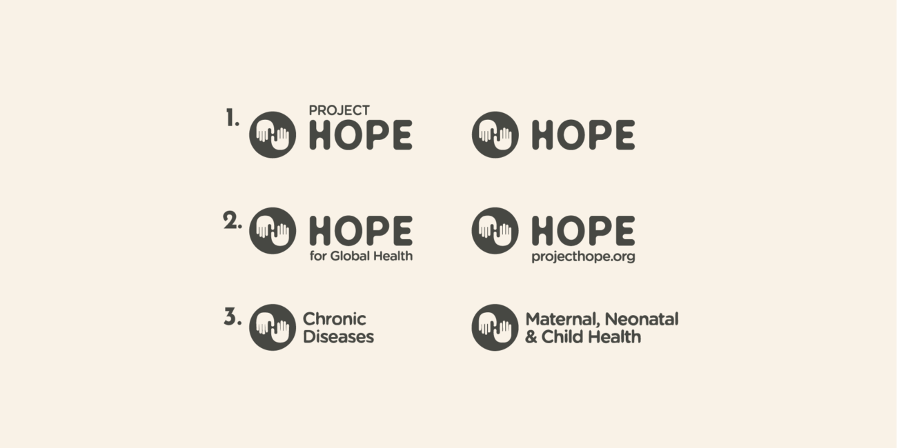
Sixty years of equity was invested in the old logo. The new logo looked like a new organization. A staged rollout was needed to help the community make the association between the new logo, and the new focus of the organization. Illustrated are: 1. the standard lockup, 2. lockups based on initiatives, and 3. lockups based on divisions.
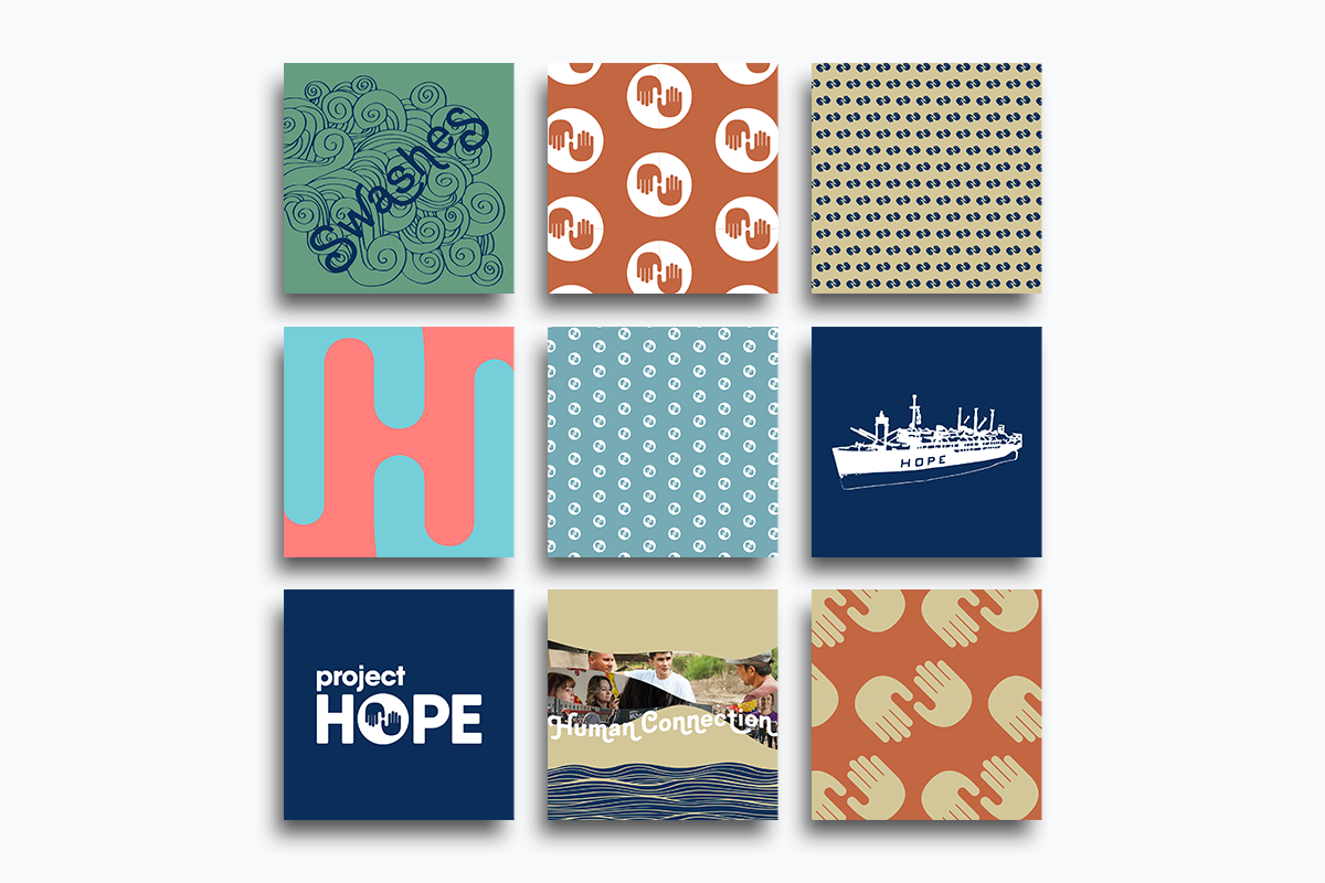
Graphic elements were created to reinforce the visual language. The hands in the logo are the most graphic element, they were used to create; 1. a supergraphic, and 2. a content holder for imagery, and callouts.
In the supergraphic, if you didn’t notice the ‘H’ in the negative space before, it becomes more apparent when blown up. By rotating the axis, and turning the hands into a pattern, the helping hands concepts becomes more apparent was they form a network of interconnected hands that come together to help the needs of global health.
The Result
As Project HOPE celebrated its 60th Anniversary Annual Gala: “Empowering Hands of HOPE” at the Andrew W. Mellon Auditorium in Washington D.C., the successful rebrand helped steer the organization in the right direction. The inspirational evening not only marked a milestone in their sixty-year legacy of excellence in global health, but also further strengthened their focus on achieving their mission of empowering health care workers all over the globe to save lives.
My name is Derek Edward, and I build brand systems. I approach complex and messy problems with a clear process, when it comes to visual design and brand strategy.