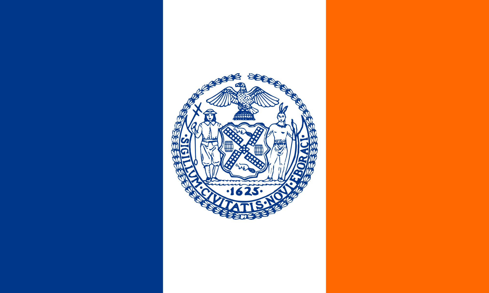
After watching Roman Mars’ “Why city flags may be the worst-designed thing you’ve never noticed“, I was inspired to do something about New York City’s flag. The story about when Chicago police die, the city’s flag drapes the coffin not the U.S. flag, really spoke to how a flag can be a source of civic pride.
The Challenge
Design according to the five principles, and evolve the brand.
Five rules of good flag design:
Keep it simple. A five year old child should be able to draw it from memory.
Use meaningful symbolism. Colors, patterns, and images should have relevant meaning.
Use two to three basic colors from the standard color set: red, white, blue, green, yellow, and black.
No lettering or seals. If you have to write the name of what you you are representing on your flag, your symbolism has failed.
Be distinctive.
The Response
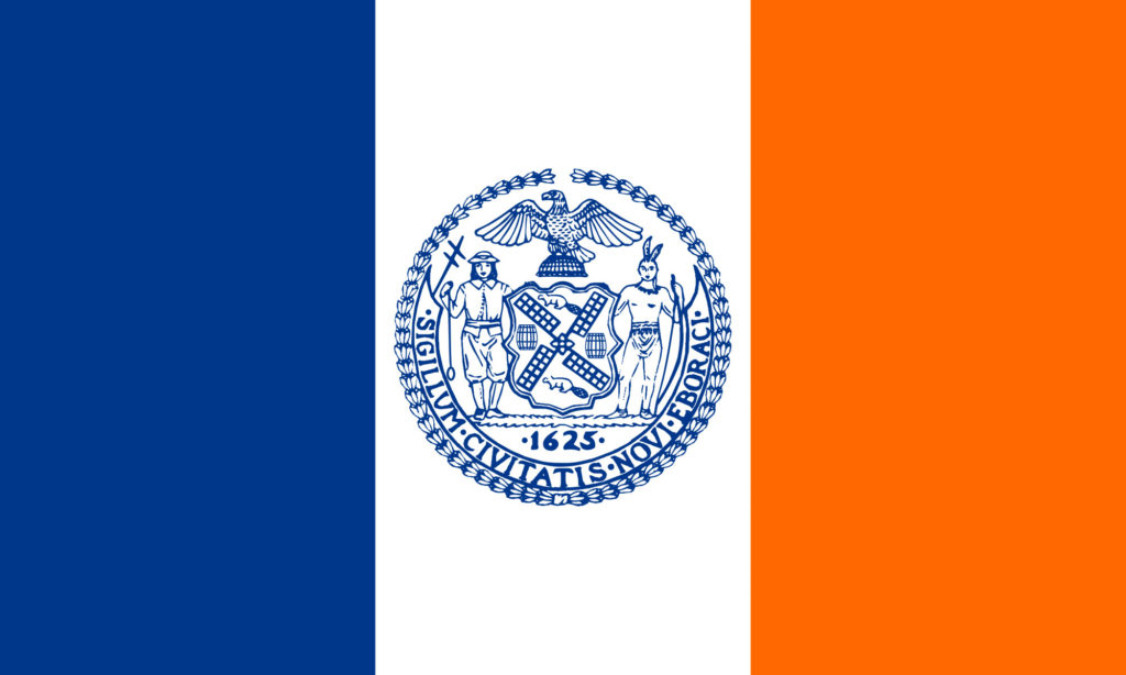
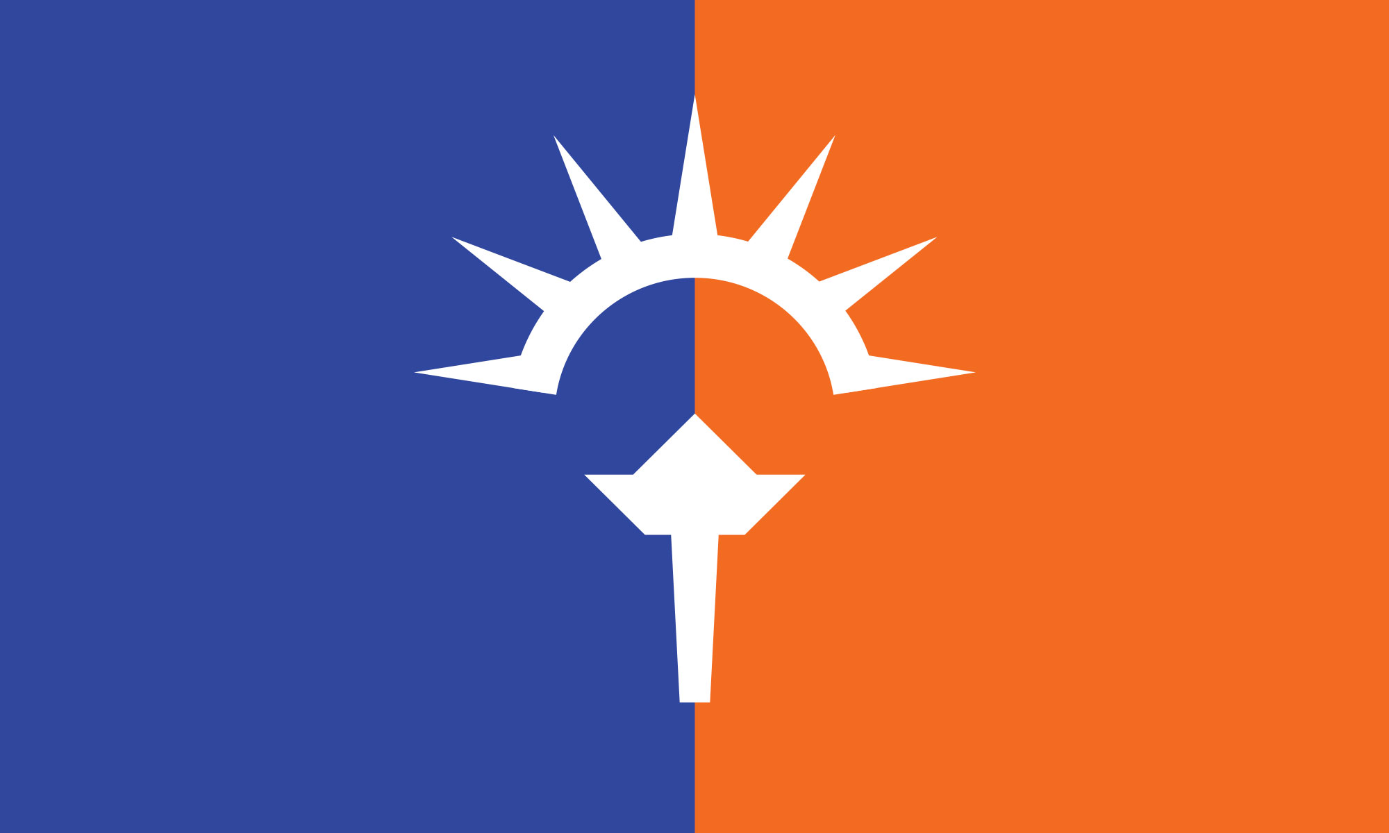
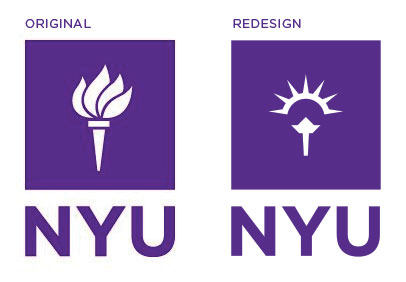
When brainstorming potential icons of NYC, I first thought of the twin towers. The towers made NYC’s landscape an icon but after 9/11, the towers became the symbol of the global war on terrorism. The Statue of Liberty ( Liberty ) is more positive and epitomizes the spirit of NYC and America. The challenge was to find a way to represent Liberty in a new way and incorporate that image with the current flag.
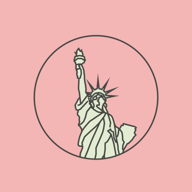
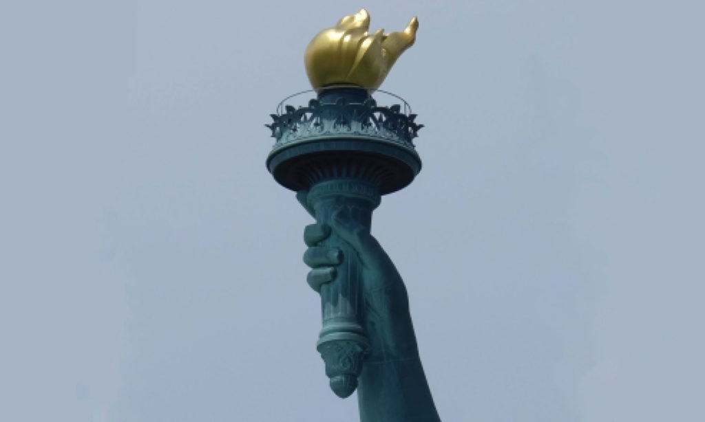
For New York City’s new flag, I focused on Liberty’s head and torch.
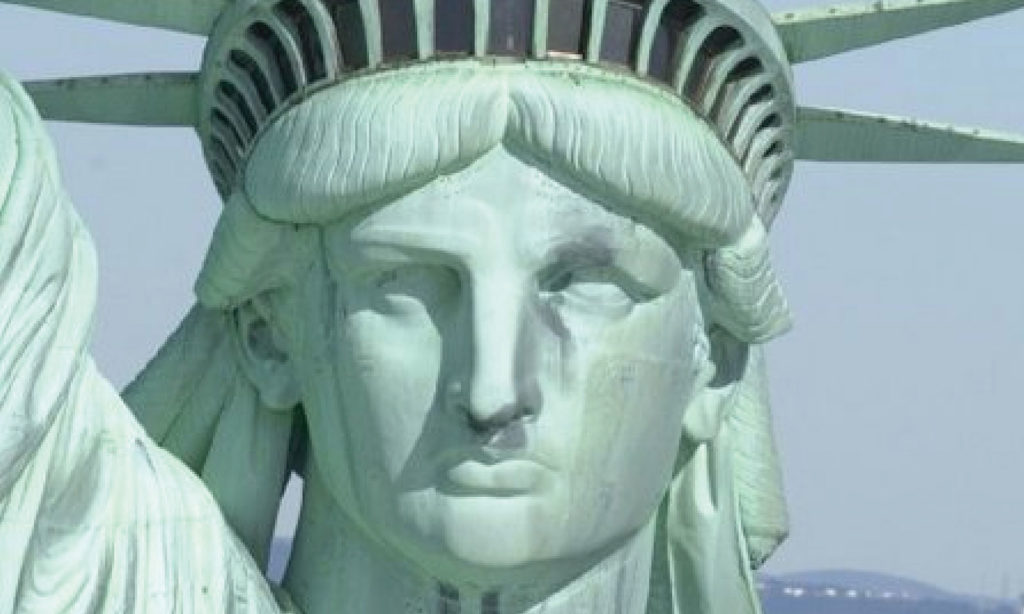
“Lady Liberty’s classic stature, face, and attire come from the Roman goddess Libertas, who also represents freedom from tyranny and oppression. The crown is reminiscent of a halo and its spikes show similarities to those of the sun gods–the Roman Apollo, and the Greek Helios.
Lady carries enlightenment to the world with the forever-lit torch (Liberty’s original name was Liberty Enlightening the World). Along with tools, the ability to create fire is one of the skills that led to civilization as we know it. Fire is symbolic of knowledge and brings light to the people.”reference
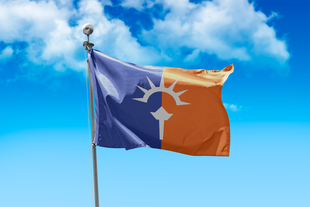
The Result
Drag
Where there was once a rift between blue and orange, the two sides are joined and united by Liberty, and the fire of enlightenment.
My name is Derek Edward, and I build brand systems. I approach complex and messy problems with a clear process, when it comes to visual design and brand strategy.